
Ggplot2 tutorial
Should you bother with ggplot?
Switching to data visualisation through code is a huge ask.
Is this how you feel about code?

How I used to feel about code.
This is a perfectly normal reaction.
But..! Can you do this?
You can do this.
Then you’re already writing code. Maybe you don’t think about yourself as a programmer … yet!
Ggplot lets you maximise your creativity with data
Let’s think about something really important to us: witch trials in the middle ages and reformation periods. This data is due to Russ and Leeson and you can find out about the paper here.
Ggplot can help us tell a story in a few charts.
This cannot possibly be a good news story:
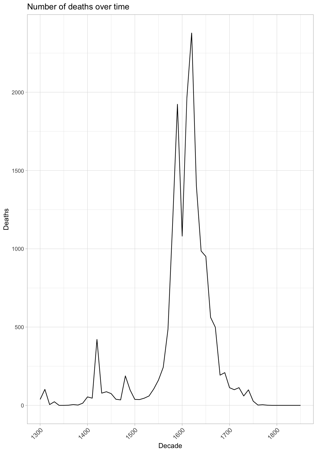
But was all Europe the same?
## Warning: Removed 3826 rows containing missing values (geom_point).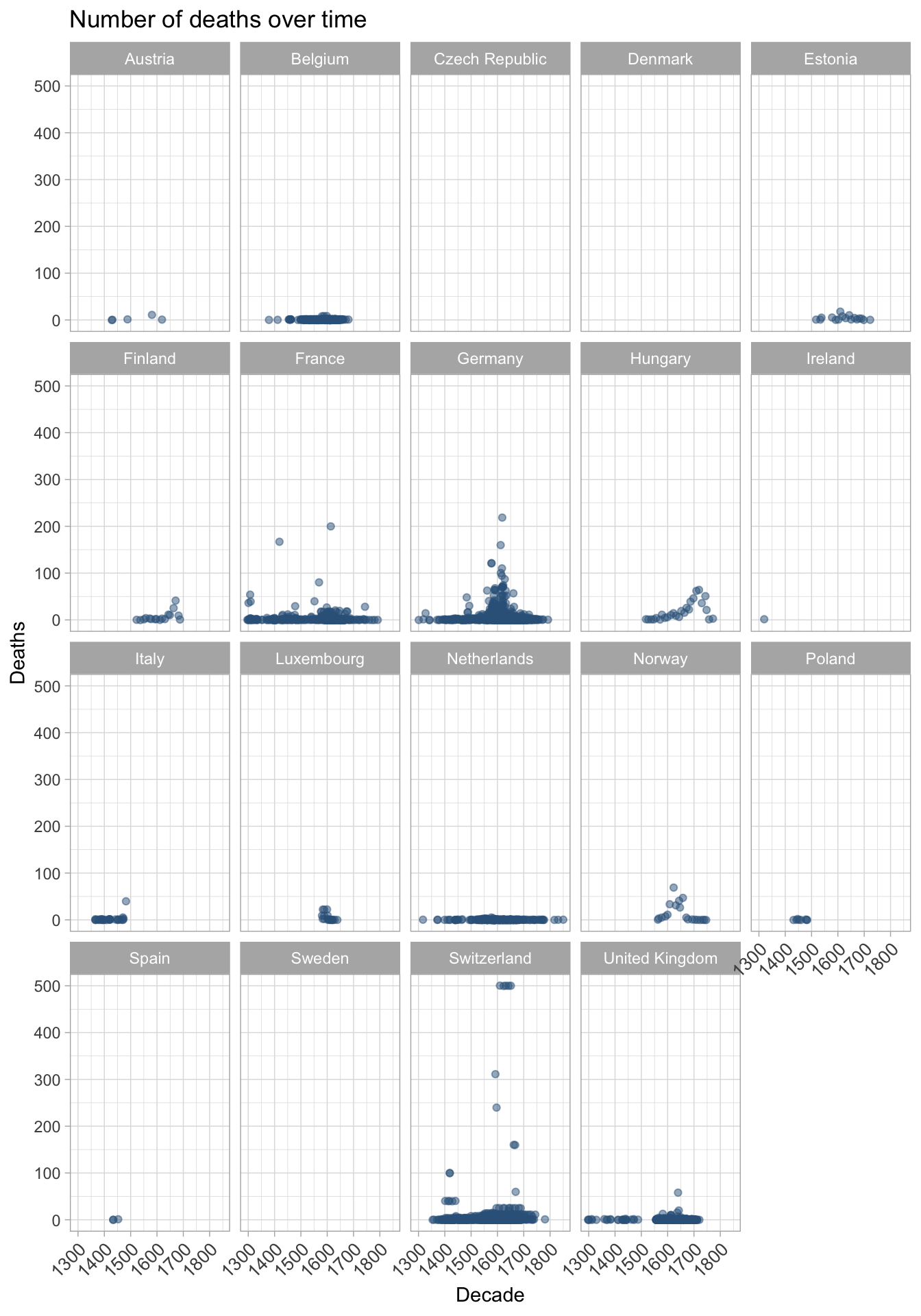
So deaths were predominantly in a few countries, does that mean that witches weren’t a concern elsewhere?
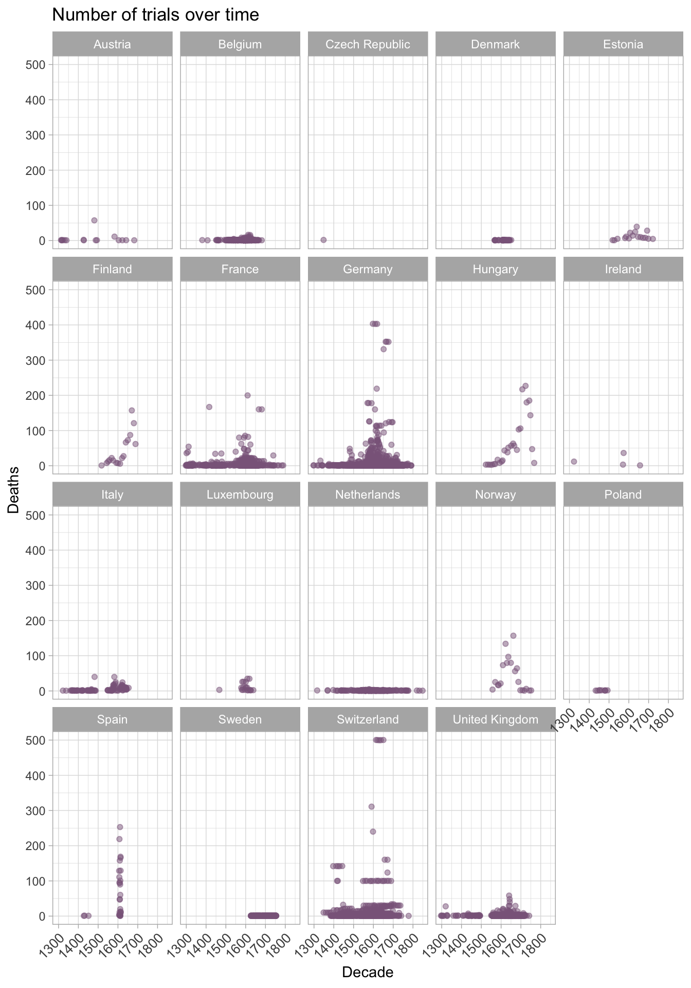
OK witchcraft was an issue across Europe, but the deaths due to trials and the number of trials were geographically located for a reason.
We got all of that out of three charts with ggplot.
Anatomy of a ggplot
The hardest thing about a ggplot is .. all the stuff. Let’s break one open and see what’s under the hood. This data is from the 2015-16 Australian Federal political donations data. Find out about it here.
I’ve cleaned up the data a bit, but let’s leave that out for now.
Here we’ve got the donation data from 2015-2016 for Australian federal political parties. Yes, I’m loads of fun at dinner parties.
ggplot(data)+
  labs(x="Recipient", y="Donor Category")+
  geom_jitter(aes(recipient.group, donor.category, colour=recipient.group), alpha=0.4)+
  theme(plot.margin = unit(c(1,1,1,1), "lines"))+
  theme(legend.position="bottom")+
  scale_colour_manual(name="", values=colour_vec) +
  theme_light()+
  theme(axis.text.x = element_text(angle = 45, hjust = 1))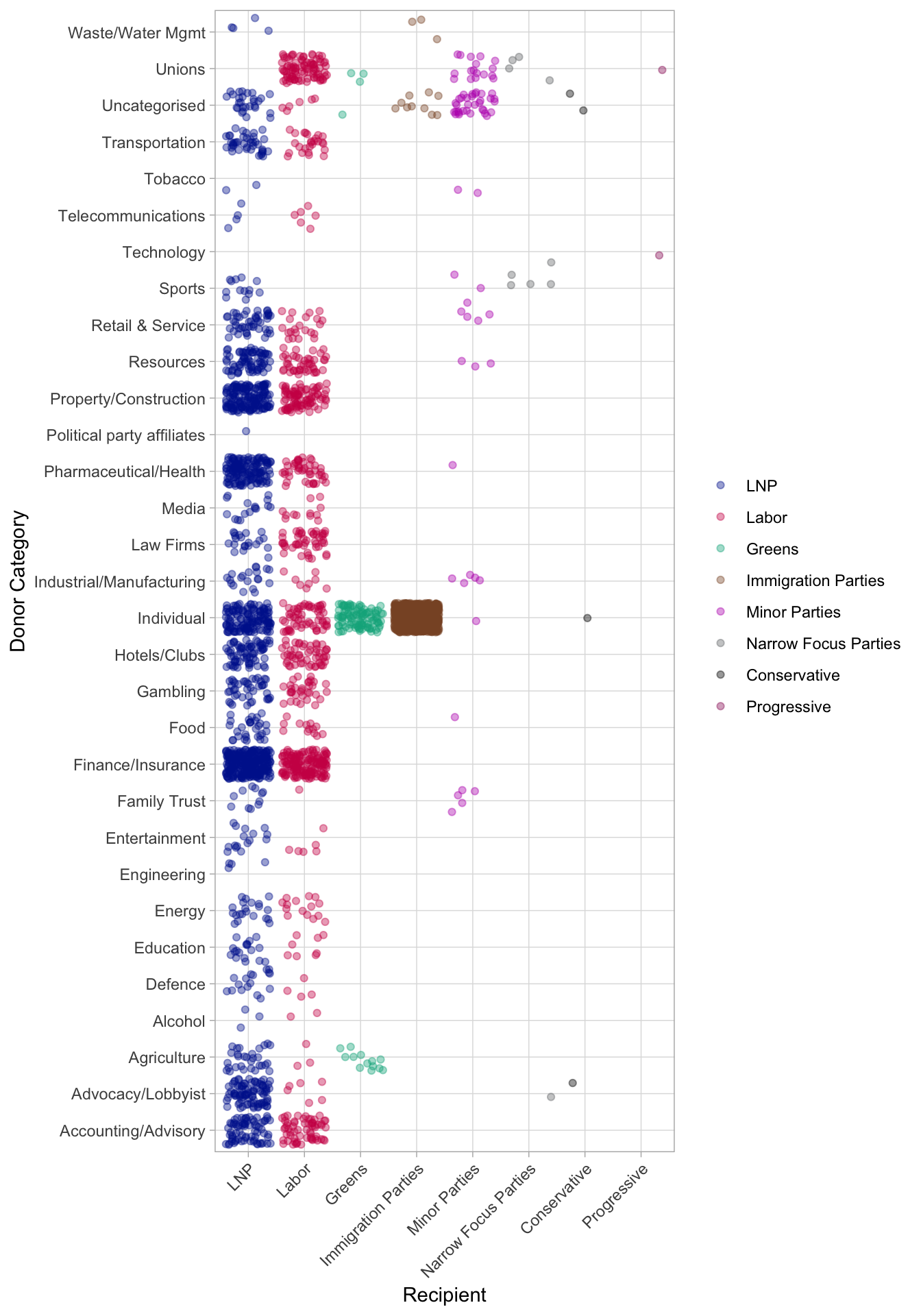
So we have our plot, but how does it all fit together?
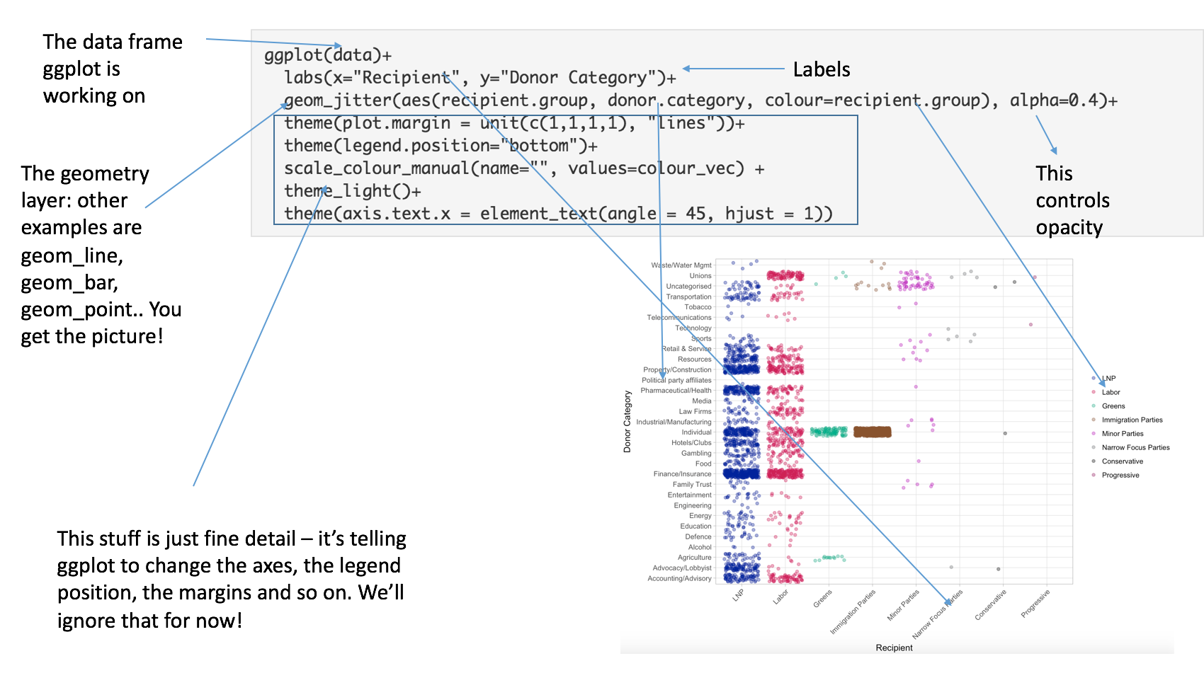
Exploded ggplot
Let’s build one of our own
Ggplot is the R implementation of The Layered Grammar of Graphics. There are a few layered grammars in the data science world, and this was probably the first.
That means that you build a base plot, then add the optional extras. Let’s try one of our own.
Back to the witches!
In order to use ggplot, you need to load it onto your computer using install.packages("ggplot2") once only.
Every time you want to use it you load it into your working environment with library(ggplot2). You only need to do this once per session.
db is the dataframe we have stored the witch trial data in. It’s alot like a spreadsheet, really.
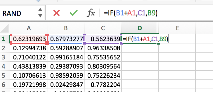
Layer One: make a ggplot object
library(ggplot2)
ggplot(db)
Nothing much happened. We have created a ggplot object and we told ggplot where to find the data on it, but nothing else.
We build up ggplot layers by adding + at the end of every line.
Layer Two: add a geom_point.
To do this, we need to tell ggplot what kind of point and that means calling the aesthetics of the geom.
We don’t need to use library(ggplot2) every time we want a ggplot, so we’ll omit it from now on.
ggplot(db)+
  geom_point(aes(x = decade, y = tried))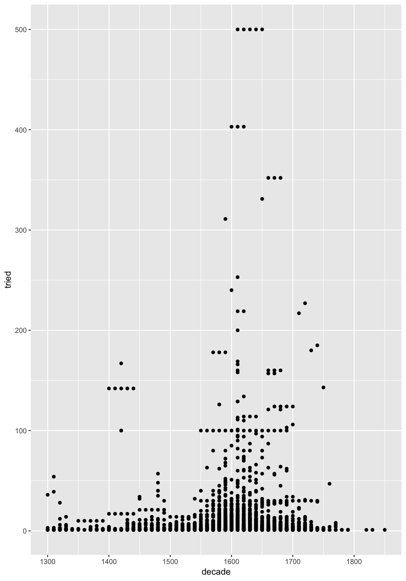
Note how I declared that the x axis is the decades, and the y the number of people tried. This told geom_point() how it needed to work.
… OK we’ve got something!
How can we make the points red?
Sometimes we can use colour to describe information on the plot. Let’s put colour = country inside the aes() call. What happens?
ggplot(db)+
  geom_point(aes(x = decade, y = tried, colour = country))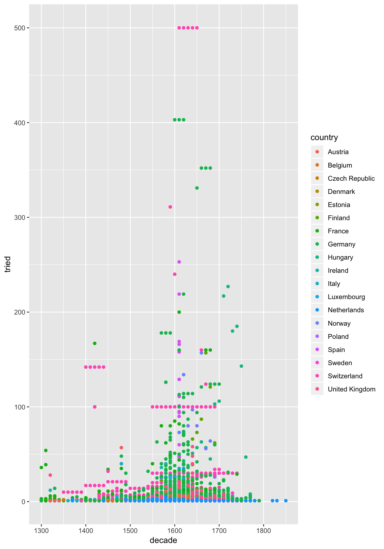
Layer 3: Facetting
One of the most useful things about ggplot is the ability to break out many charts at once to make quick comparisons. It’s called facetting the chart. Let’s do that.
ggplot(db)+
  facet_wrap(~country)+
  geom_point(aes(x = decade, y = tried, colour = country))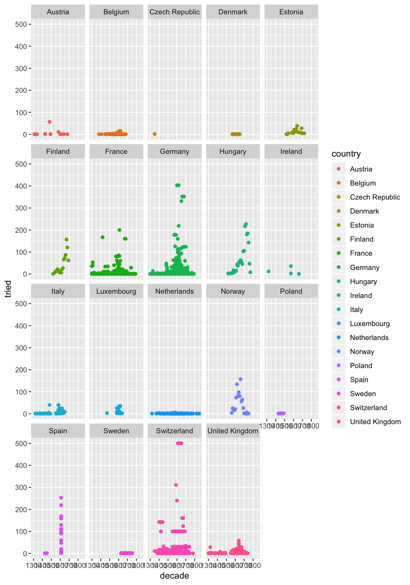
We can control how the facetting looks. Let’s try changing the facet line to facet_wrap(~country, ncol = 3)+
ggplot(db)+
  facet_wrap(~country, ncol = 3)+
  geom_point(aes(x = decade, y = tried, colour = country))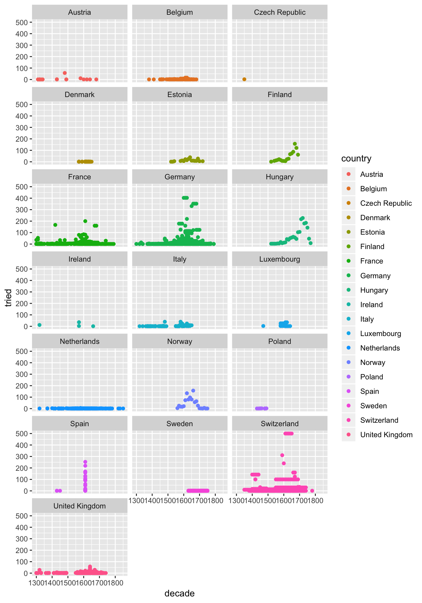
Layer 4: Make it look good.
I don’t love the grey background. Let’s try adding theme_light() at the end.
ggplot(db)+
  facet_wrap(~country, ncol = 3)+
  geom_point(aes(x = decade, y = tried, colour = country), alpha = 0.4)+
  theme_light()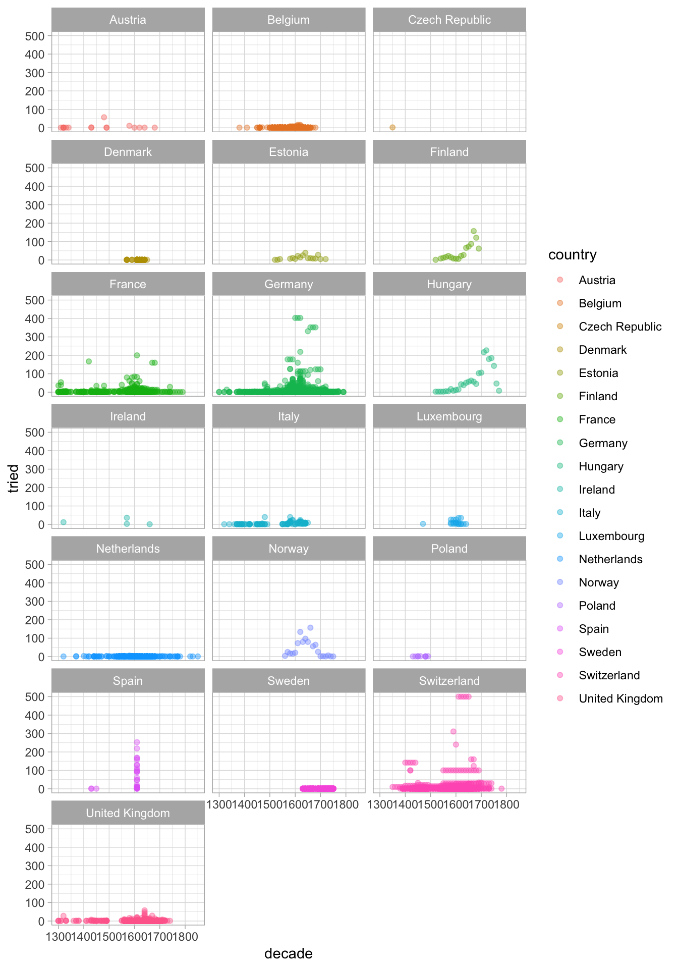
Opacity is another great way to see data when you have many observations. Let’s try adding alpha = 0.4 to the geom_point() call. It goes after the aes() part.
Layer 5: Tell people what they’re looking at.
Time for some titles. You can use ggtitle("Insert my title here") and layers xlab("label x") and ylab("label y") to add further layers to your plot.
ggplot(db)+
  facet_wrap(~country, ncol = 3)+
  geom_point(aes(x = decade, y = tried, colour = country), alpha = 0.4)+
  theme_light()+
  ggtitle("Witch trials in the Middle Ages and Reformation Periods")+
  xlab("Decade")+
  ylab("Number of trials")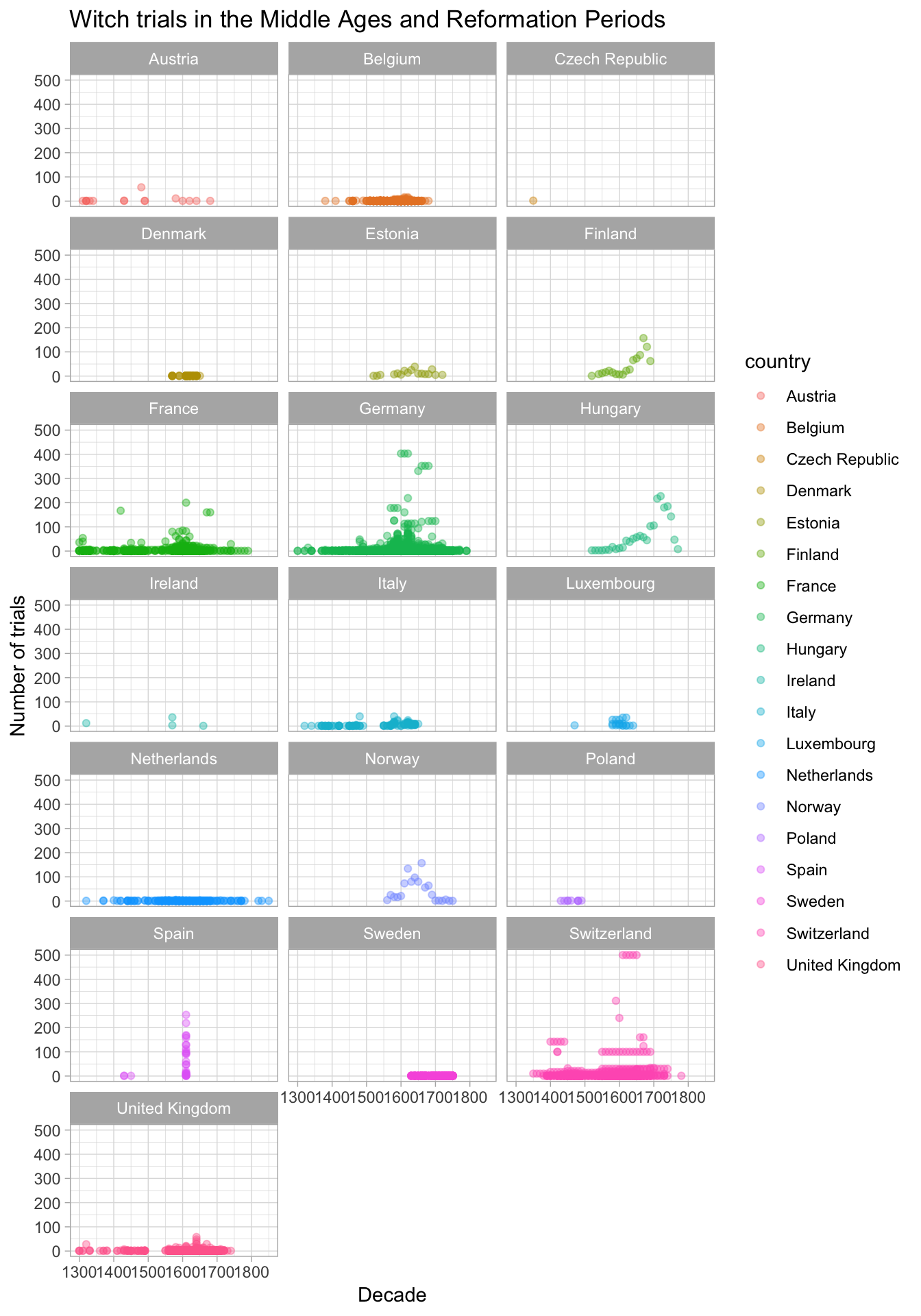
Get beyond the bar chart
The whole point of coding up your visualisations in ggplot is that you can get really creative. I got this data on Sydney temperatures from the Bureau of Metereology site.
Let’s load it and clean it up a little.
# data from: http://www.bom.gov.au/jsp/ncc/cdio/weatherData/av?p_nccObsCode=36&p_display_type=dataFile&p_startYear=&p_c=&p_stn_num=066062 22/09/18
temp <- read.csv("./data/IDCJAC0002_066062_Data1.csv")

temp$date <- paste(temp$Year, temp$Month, "01", sep = "-")
temp$date <- lubridate::ymd(temp$date)
temp$Month <- factor(temp$Month, labels = c("January",
"Febuary",
"March",
"April",
"May",
"June",
"July",
"August",
"September",
"October",
"November",
"December"))Take the daily maximum temperature in Observatory hill, Sydney: this is pretty plain, but it’s easy to follow. A simple line chart showing temperature.
ggplot(temp)+
  geom_line(aes(x = date, y = Mean.maximum.temperature...C.))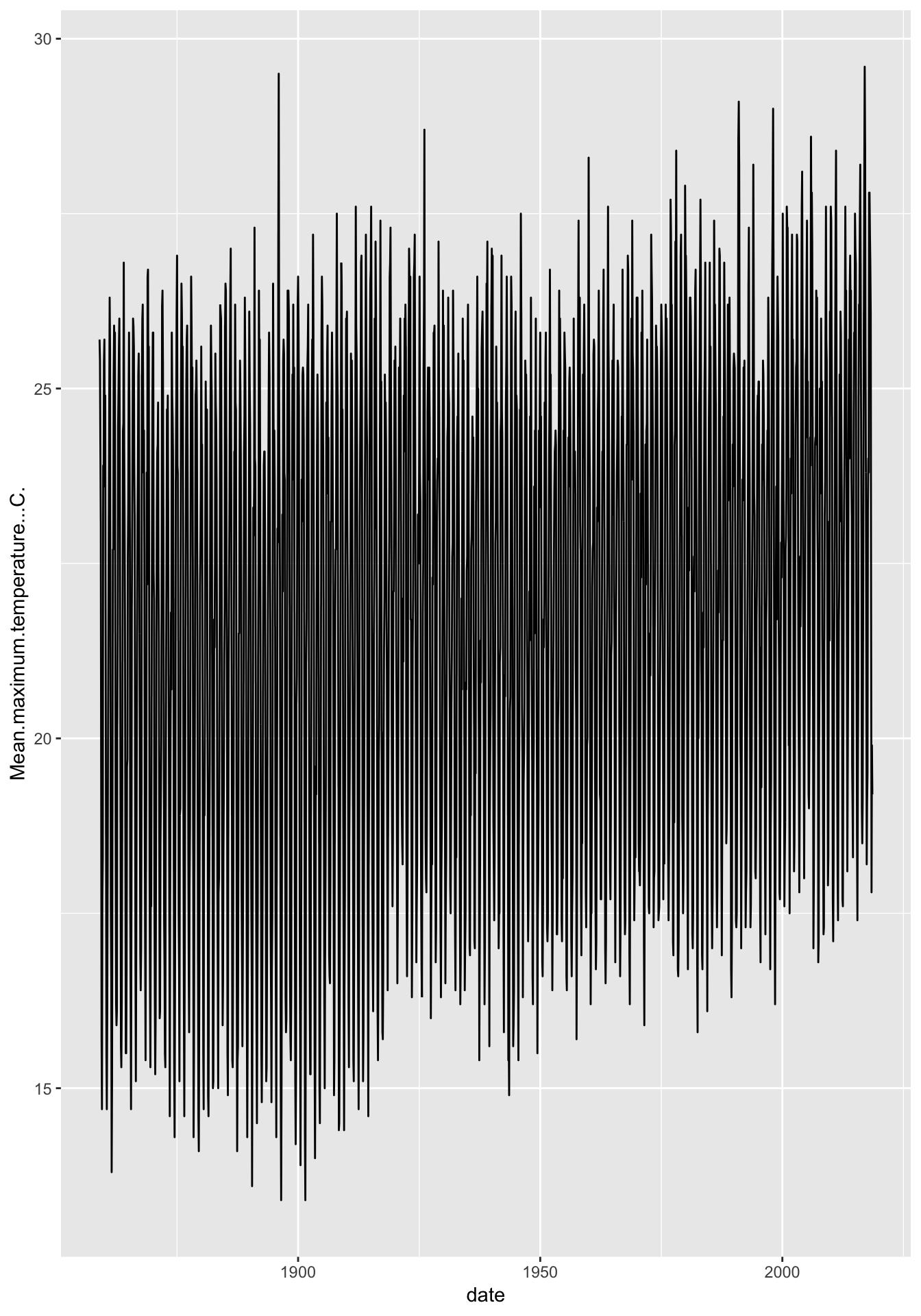
Only look at what you want to
Looks like we have something of a trend over time here. We could actually work a little R magic on this one and perhaps just look at January temperatures:
ggplot(filter(temp, Month == "January"))+
  geom_line(aes(x = date, y = Mean.maximum.temperature...C.))+
  theme_light()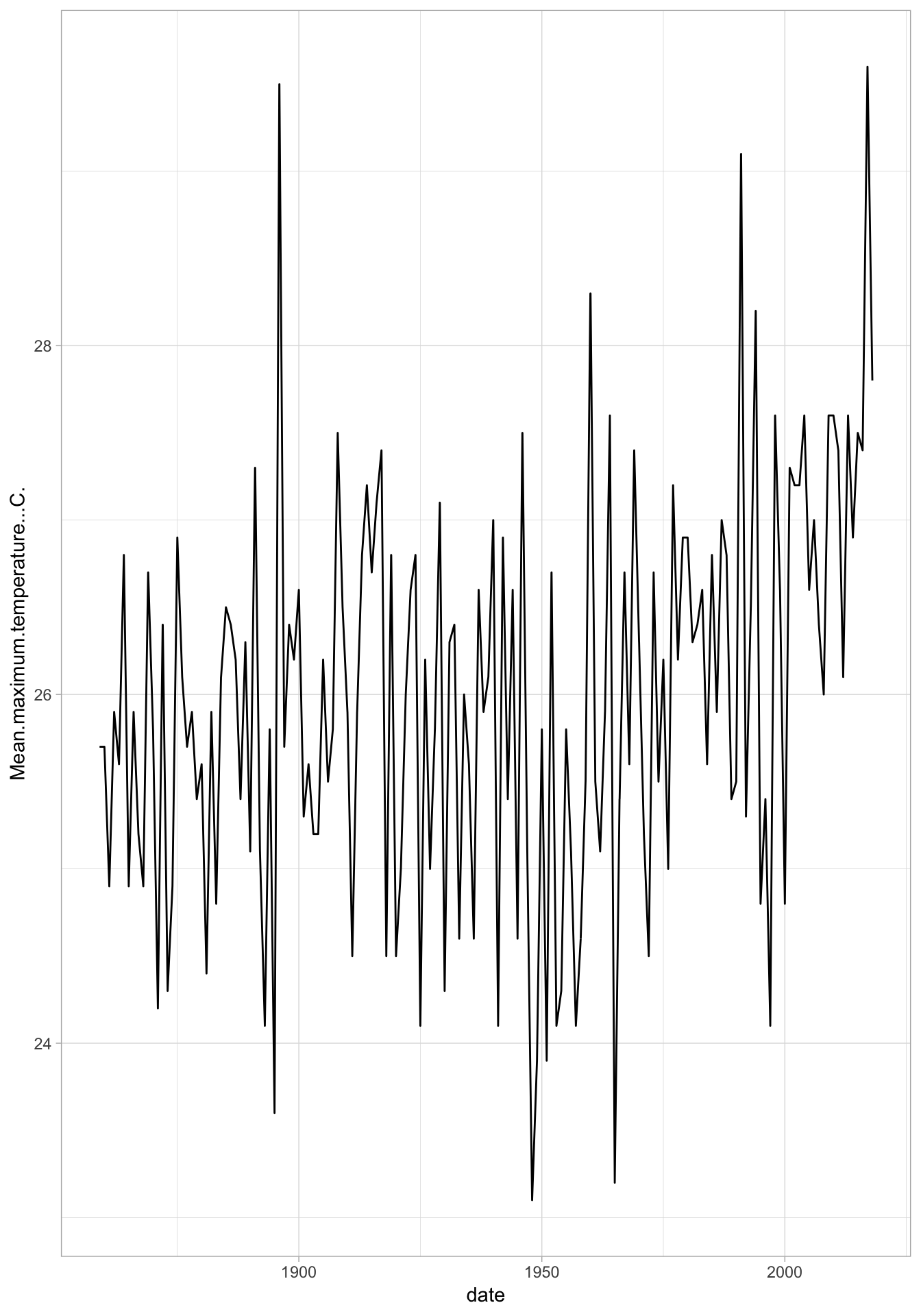
Just a boring old line plot.
It doesn’t have to be boring in R
ggplot(temp)+
  facet_wrap(~Month)+
  geom_jitter(aes(x = date, y = Mean.maximum.temperature...C., colour = Month), alpha = 0.2)+
  theme_light()+
  coord_polar()+
  ylab("Mean maximum temperature (celsius)")+
  ggtitle("Mean maximum temperature in Sydney")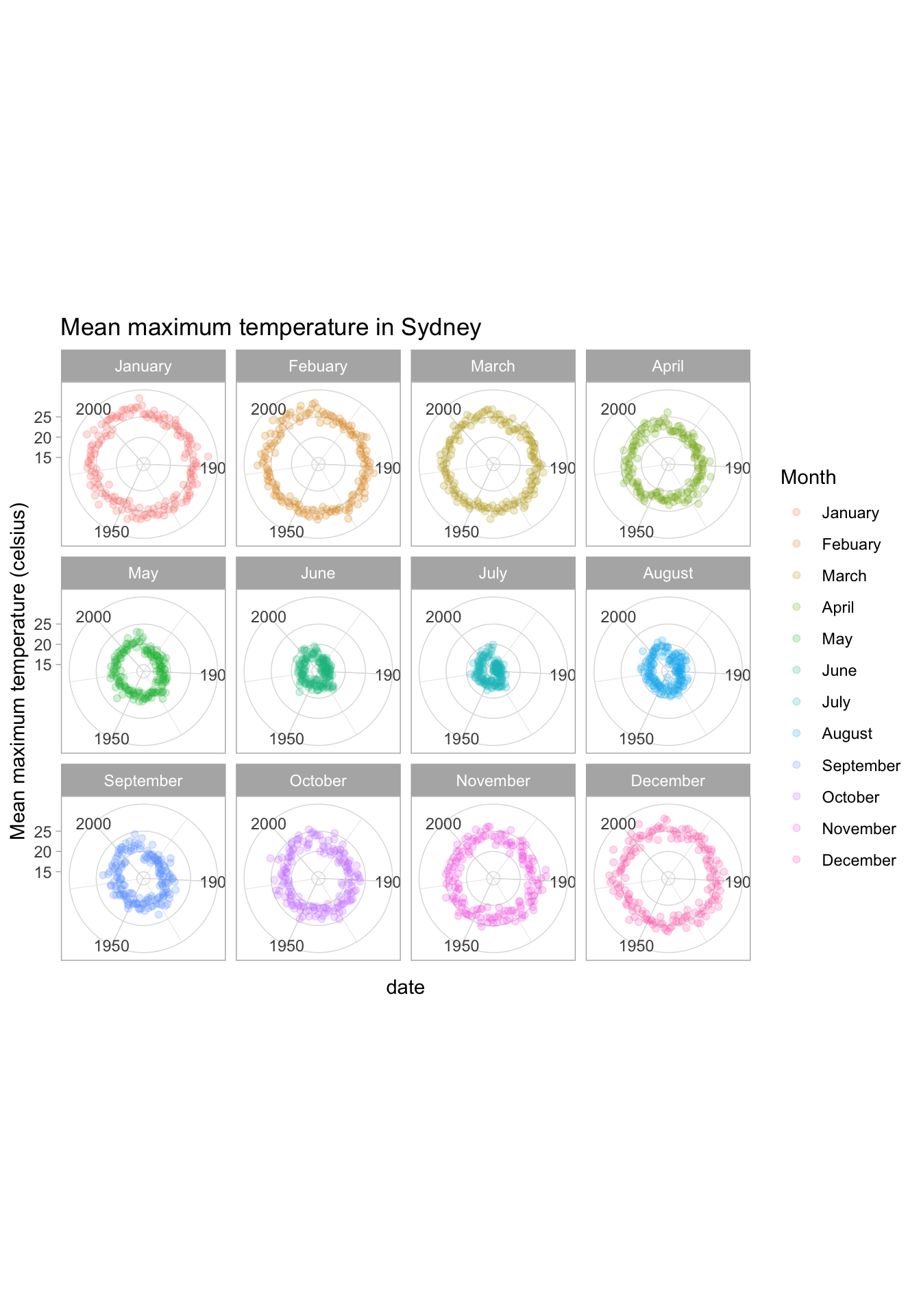
Ggplot plays nicely with others
Open source software lives and breathes on people with great ideas just going for it.
Interactivity is one of those ideas. Take our Auspol donation data and let’s take another look:
library(plotly)
ggplot(data)+
  labs(x="Recipient", y="Donor Category")+
  geom_jitter(aes(recipient.group, donor.category, colour=recipient.group), alpha=0.4)+
  theme(plot.margin = unit(c(1,1,1,1), "lines"))+
  theme(legend.position="bottom")+
  scale_colour_manual(name="", values=colour_vec) +
  theme_light()+
  theme(axis.text.x = element_text(angle = 45, hjust = 1))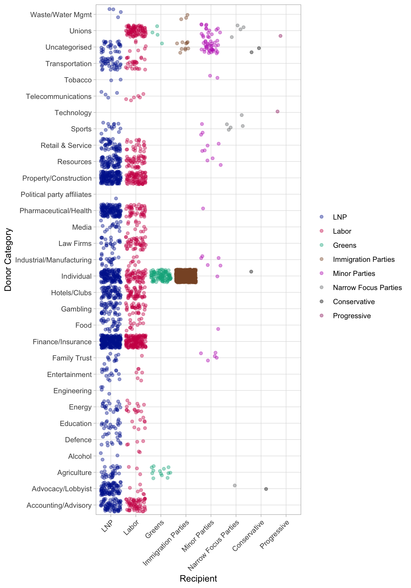
ggplotly()This is going to be very useful, right? It only took two additional lines: library(plotly) at the beginning and ggplotly() at the end of the ggplot. Remember to install.packages("plotly") the first time you use the package.
Let’s try another:

So.. ggplot is definitely doable! Fingers crossed you feel a bit more like this now.
More like this please!