
Data Driven: By Design
General Excel · publications · get started
The data revolution is upon us! Or at least that’s what someone with a snappy grasp of copy-editing and a mandate for clicks would say.
There’s a common misperception that’s out there in the data world that only some of us know how to be data driven. Only some of us have our data driving licenses and can get behind the wheel.
This is manifestly false. Even if you don’t know R or Python or any other part of the common data science toolkit (yet), there are things you can do and start to think about today as you begin to embrace the idea of data-driven decision making.
A lot of people talk about how new all this data and data science is. While our industry has changed rapidly, both in the amount, quality and type of data we have access to and can interrogate, a lot hasn’t changed.
We’re all still on the same mission we were 15 years ago (maybe a bit more) when I started out: we’re here to create some kind of value. The purpose of our work isn’t to execute a fancy model: it’s to find an insight that will drive value.
That’s good news: because in addition to all the complexity we’re now dealing with, we have a pretty good grasp on the basics.
Being data driven is a skillset, not a toolkit. You don’t need a particular programming language or application (though we all have favourites and I clearly have mine). You don’t absolutely require model X or statistic Y. Qualifications might be necessary in some contexts, but there’s no data driver’s license: just data people.
Data navigation is a learned art form. The more you explore data, the better you’ll get at navigating it. So here’s five tips to get you started.
Tip One: viz early, viz often
You’ve probably heard of Kickstarter.A full dataset of all the kickstarter campaigns since inception was made available to the public on Kaggle and we can use this to start exploring real business contexts.
The basic idea of Kickstarter is that people tell their stories, pitch their ideas: the public pledges.
You can start visualisaing your own data sets today. You’re all accountants, you know how to break out that excel spreadsheet. You can start right there with simple visual explorations of the data you’re working with. If you have access to more sophisticated tools like R, Tableau or Spotfire, that’s great: but don’t rule out the poor cousin of data science: Excel. Like I said: skillset, not toolkit.
Let’s take a look at how we might use this in a business context – when you’re navigating on the road to value, you need to look around!
Using visualisation to find things is a very interrogatory process. What are you seeing? Why is it there? How did it come to be this way?
If we look at the number of campaigns launched by day since Kickstarter itself launched, we can start to understand the trajectory of the website over time.
library(tidyverse)## Warning: package 'ggplot2' was built under R version 3.4.4## Warning: package 'tibble' was built under R version 3.4.3## Warning: package 'tidyr' was built under R version 3.4.3kdata <- read.csv("./data/ks-projects-201801.csv", sep = ",") # read in the data
kdata$launched <- as.Date(kdata$launched) # set dates to a date type for ease of plotting
kdata <- filter(kdata, kdata$launched >= "2009-04-28") # There's some dirty data, keep only those observations *after* kickstarter was launched :)
byDate <- kdata %>% group_by(kdata$launched) %>% # group the data by date
summarise(nCampaigns = n()) # count the number of launches on each date
# use ggplot to plot!
ggplot(byDate) +
geom_line(aes(`kdata$launched`, nCampaigns), colour = "#aed9da")+
xlab("Launch date") +
ylab("Number of campaigns")+
theme_light()+
theme(plot.background = element_rect(fill = "transparent",colour = NA))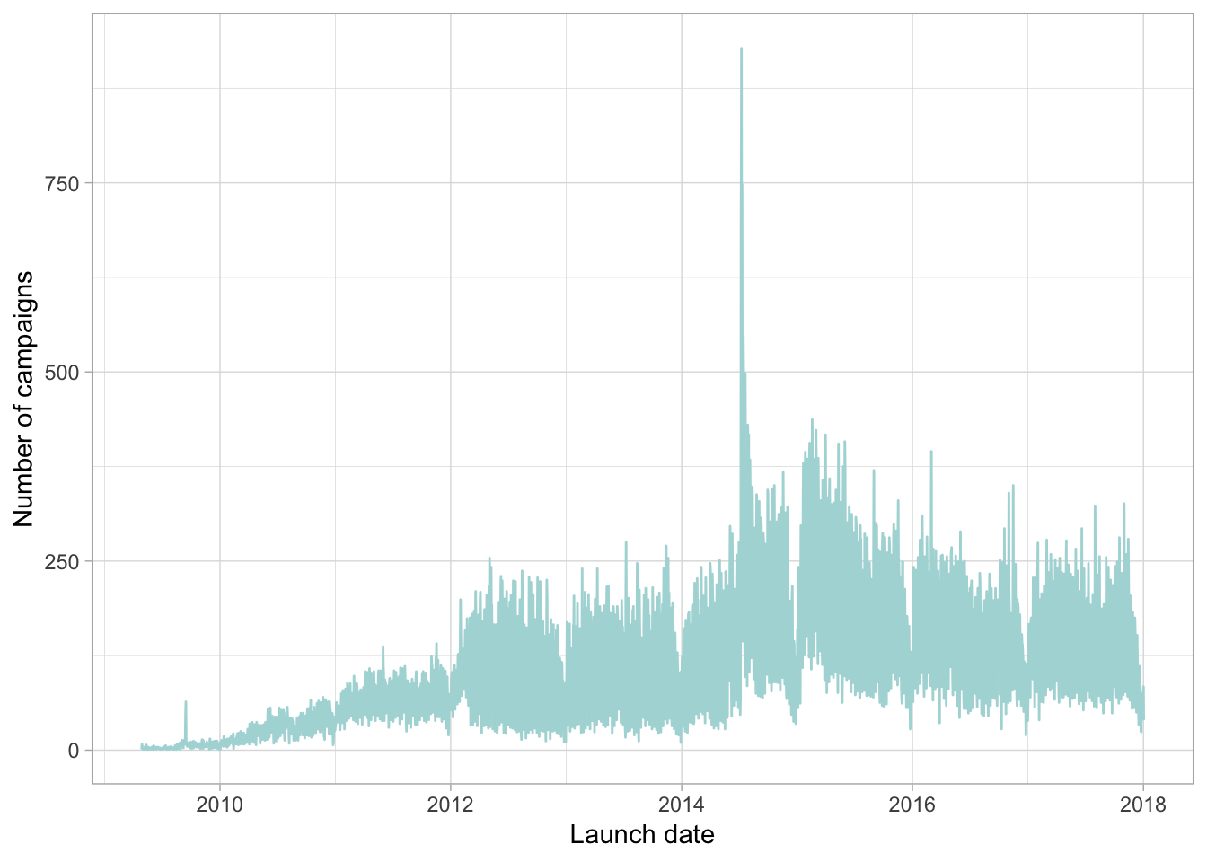
Not quite ready to tackle R yet? Don’t let that stop you. With a few extra steps, you can start visualising the same thing in Excel like this:

Looks familiar
In order to get to the same point in Excel:
* I had to work out what the date range was
* Collapse the date and time column into a date-only column
* Create a column for the required dates
* Use a countif formula for each day
* Because the dataset is so large, I then had to copy and paste-special as values for the countif formula so the spreadsheet was workable.
Start today
While R is much more efficient, my point here is that you don’t have to wait to be competent in R to start being data driven.
So what did we see from the plots? We saw potato salad.
We can see launches trended along nicely from the website unveiling and levelled out in the last couple of years. If we were working with the kickstarter team and wanted to look at utilisation rates, that big spike in the middle there would be of great interest to us. What happened in July 2014?
Someone launched a kickstarter campaign for potato salad on july 06, 2014. Three days later, it’s going viral and the website and the campaign receive international coverage on a scale it neer has before..That’s the time of the spike in campaign launches there.
A hypothesis we can take from this chart is that potato salad man launched a wave of users on the website. Data science lets us test that hypothesis, but it also lets us test deeper and more meaningful questions:
* Did that viral attention translate into real gains in the user base?
* Were the campaigns launched in the wake of salad-gate different to the ones that came before – were they for more or less money? Joke campaigns or serious self starters?
* These are questions we can start to answer with this data
By visualising early, we have some key questions to ask. You might not be ready to test complex salad-related hypotheses after a single blog post – but by visualising your data, you’re armed with questions to ask. Once you know the questions to ask, you can map out how you’re going to answer them.
Tip Two: Value can come from aggregation
(This one is owing to Nicole Radziwill who suggested it during a Twitter conversation when I asked what data scientists would tell a room full of non data scientists about being data driven. Thanks Nicole!)
Finding insights to transform your decisions into data driven ones could come from complex models, code and mathematical equations. But it can also come from aggregating many pieces together, both within and between data sets.
Being data driven means defining clear destinations. What is it that measures your outcome and can you measure that accurately? Can we aggregate sensibly over groups to get an overall view of the data that provides insight?
Here’s an example using data on Australian federal political doncations for the 2015/16 financial year. The ABC released this data in early 2017 and made it available openly.
The ABC took the register of donations and aggregated them across donor categories - the original data was simply donor info which by itself was not particularly useful. I’m going to take the recipient categories and aggregate them further to see if we can gain some insight about who donates to whom in Australian politics.
# load and read the data, clean it up a little

library(readxl)
data<-read_xlsx("./data/donor-declarations-categorised-2016.xlsx", sheet="donor-declarations-categorised-", col_names = TRUE)
data$`recipient-name`<-as.factor(data$`recipient-name`)
data$`party-group`<-as.factor(data$`party-group`)
data$`donor-state`<-as.factor(data$`donor-state`)
data$`donor-category`<-as.factor(data$`donor-category`)
data$`donor-postcode`<-as.numeric(data$`donor-postcode`)

# Make some lists - there are lots of branches of parties all considered seperately in this data. Let's AGGREGATE them into meaningful groups.

statelist<- c("ACT", "NSW", "NT", "QLD", "SA", "TAS", "VIC", "WA")
conservative.list<-c("Australian Christians", "Family First Party", "Family First Party - SA", "Democratic Labor Party (DLP) - Queensland Branch")
progressive.list<-c("Australian Equality Party (Marriage)", "Socialist Alliance")
greens.list<-c("Australian Greens", "Australian Greens, Tasmanian Branch", "Queensland Greens", "The Australian Greens - Victoria", "The Greens (WA) Inc", "The Greens NSW", "Australian Greens, Victorian Branch")
labor.list<-c("Australian Labor Party (ACT Branch)", "Australian Labor Party (ALP)", "Australian Labor Party (N.S.W. Branch)", "Australian Labor Party (Northern Territory) Branch", "Australian Labor Party (South Australian Branch)", "Australian Labor Party (State of Queensland)", "Australian Labor Party (Tasmanian Branch)", "Australian Labor Party (Victorian Branch)", "Australian Labor Party (Western Australian Branch)")
immigration.list<-c("Australian Liberty Alliance", "Citizens Electoral Council of Australia", "Sustainable Australia")
narrow.list<-c("Australian Recreational Fishers Party", "Help End Marijuana Prohibition (HEMP) Party", "Australian Sex Party", "Shooters, Fishers and Farmers Party")
LNP.list<-c("Country Liberals (Northern Territory)", "Liberal National Party of Queensland", "Liberal Party (W.A. Division) Inc", "Liberal Party of Australia", "Liberal Party of Australia - ACT Division", "Liberal Party of Australia - Tasmanian Division", "Liberal Party of Australia (Victorian Division)", "Liberal Party of Australia, NSW Division", "National Party of Australia", "National Party of Australia - N.S.W.", "National Party of Australia - Victoria", "National Party of Australia (WA) Inc", "Liberal Party of Australia (S.A. Division)")
minor.list<-c("Glenn Lazarus Team", "Jacqui Lambie Network", "Liberal Democratic Party", "Nick Xenophon Team", "Palmer United Party", "VOTEFLUX.ORG | Upgrade Democracy!", "Katter's Australian Party")

data$recipient.group<-NA
 for (i in 1:length(data$`donor-state`)){
   if((data$`donor-state`[i]%in%statelist)==TRUE)
     {data$`donor-state`[i]<-data$`donor-state`[i]}
   if((data$`recipient-name`[i]%in%conservative.list)==TRUE)
     {data$recipient.group[i]<-"Conservative"}
   if((data$`recipient-name`[i]%in%progressive.list)==TRUE)
     {data$recipient.group[i]<-"Progressive"}
   if((data$`recipient-name`[i]%in%greens.list)==TRUE)
     {data$recipient.group[i]<-"Greens"}
   if((data$`recipient-name`[i]%in%labor.list)==TRUE)
     {data$recipient.group[i]<-"Labor"}
   if((data$`recipient-name`[i]%in%immigration.list)==TRUE)
     {data$recipient.group[i]<-"Immigration Parties"}
   if((data$`recipient-name`[i]%in%narrow.list)==TRUE)
     {data$recipient.group[i]<-"Narrow Focus Parties"}
   if((data$`recipient-name`[i]%in%LNP.list)==TRUE)
     {data$recipient.group[i]<-"LNP"}
   if((data$`recipient-name`[i]%in%minor.list)==TRUE)
     {data$recipient.group[i]<-"Minor Parties"}
   if(is.na(data$recipient.group[i])==TRUE)
     {print(data$`recipient-name`[i])}
 }


# choose some colours

 colour_vec<-c("#00239C" ,"#CE0056","#00B08B", "#89532F", "#BB29BB", "#75787B", "#000000", "#991E66", "#006F62" )


# consider these factor variables for ease of display
data$`donor-state`<-factor(data$`donor-state`, levels=c("ACT", "NSW", "NT", "QLD", "SA", "TAS", "VIC", "WA", "NA"))
data$recipient.group<-factor(data$recipient.group, levels=c("LNP", "Labor", "Greens", "Immigration Parties", "Minor Parties", "Narrow Focus Parties", "Conservative", "Progressive"))

# use ggplot2 to create a visual

ggplot(data)+
  labs(x="Recipient", y="Donor Category")+
  geom_jitter(aes(recipient.group, `donor-category`, colour=recipient.group), alpha=0.4)+
  theme(plot.margin = unit(c(1,1,1,1), "lines"))+
  theme(legend.position="bottom")+
  scale_colour_manual(name="", values=colour_vec) +
  theme_light()+
  theme(axis.text.x = element_text(angle = 45, hjust = 1))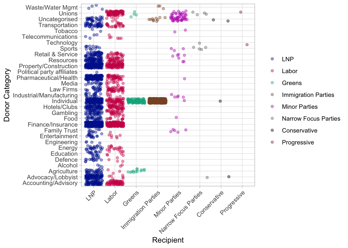
Down the y axis we have different donor groups, and across the x axis, we have groups of parties There’s the obvious big ones – Liberal, Labour, Greens
There’s also clusters of smaller parties that I’ve grouped by their common core issue.
The data didn’t arrive this way – the ABC categorised the donors and I categorised the parties. Without that aggregate we wouldn’t have been able to pick out patterns: that’s where aggregation adds value.
We can see banking and finance donate a lot to both major parties, but didn’t donate to the Greens party, who were calling for a royal commission around then.
The unions donated to labour, but not liberal
Advocacy/lobbyist groups donated more regularly to Liberal than Labour
The collection of parties I’ll refer to as “immigration” parties, most notably One Nation collected the vast marjority of their donor funds from individuals and ‘uncategorised’ organisations.
Without aggregation, we couldn’t see this though - we’d just know that Joe Blogs donated $X to $Y party.
Not quite ready to do this in R yet? This would not be an easy visual to reproduce in Excel, but something similar could be achieved (albeit without the visualisation) using a pivot table, as per below. Obviously R gives you more options, but if you’re looking to start thinking about and exploring aggregation: a pivot table might let you start that today.

A pivot table
Tip Three: Domain knowledge matters
Being data driven doesn’t matter if you’re driving somewhere that makes no sense. You don’t come to the data sciences a blank slate: you come to them with all of your experiences and domain knowledge: these are useful for arriving at valuable insights.
Let’s take the example of Ratesetter, a fintech that publishes its Australian loanbook quarterly ( see here, this one was downloaded 13/11/17).
loanBook <- read_xlsx("data/20170930loanbook.xlsx", sheet = "RSLoanBook", col_names = TRUE, skip = 8)

ggplot(loanBook) +
  geom_point(aes(FinanceAmount, AnnualRate),
             colour = "#aed9da", alpha = 0.2) +
  theme_light()+
  xlab("Financed Amount") +
  ylab("Annual rate paid by borrower")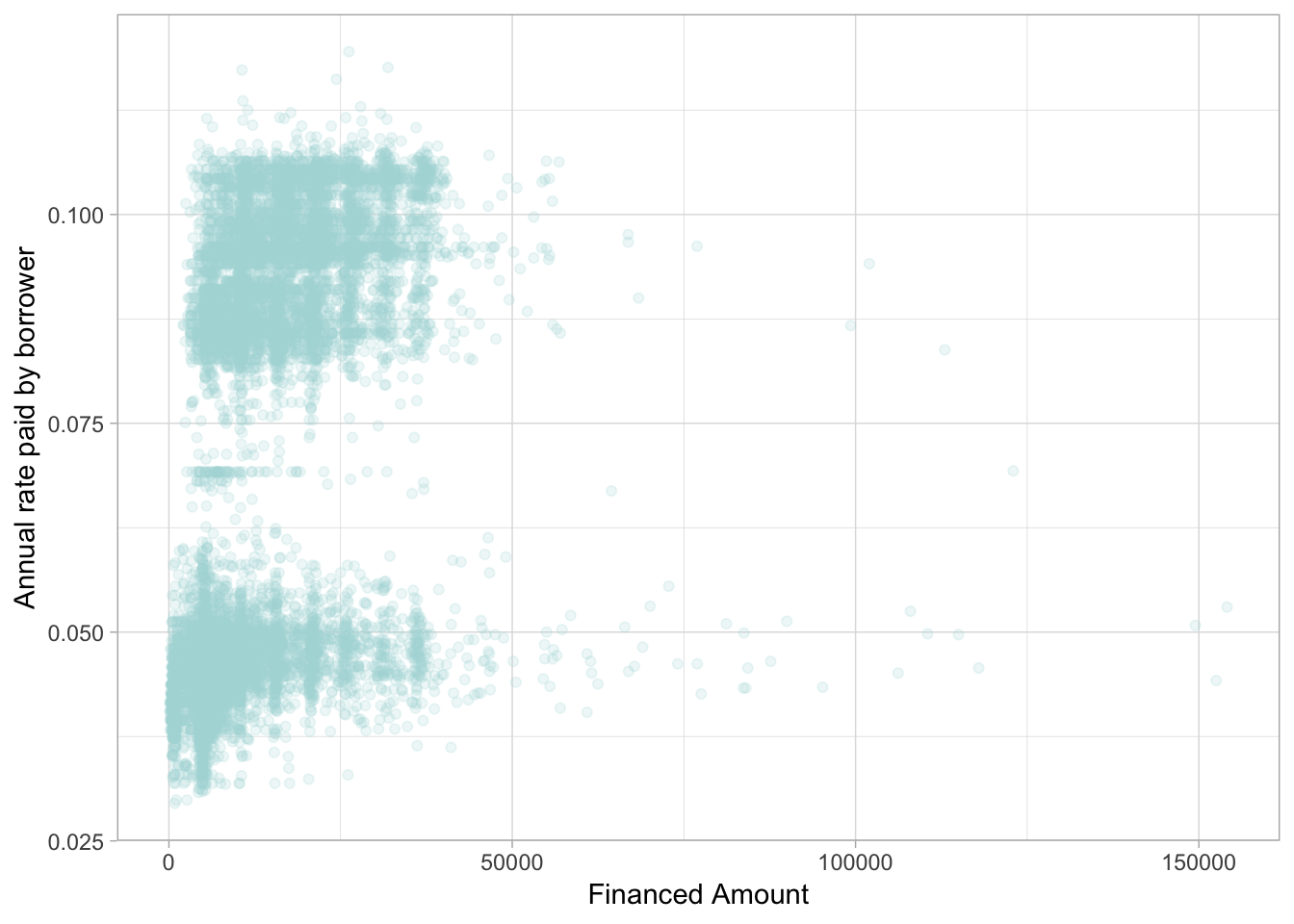
Here we have the amount borrowed by customers of Ratesetter agains the rate of interest they paid. We can see two distinct groups: but what could be the reason for this difference- people borrowing the same amount pay more or less. But why?
This is the sort of question where domain knowledge comes into play. We can start to unpack what we observe in the data. If you have any basic knowledge of finance, you’ll know that interest rates are all about risk. What are some of the key factors in risk to a lender? Things like income, borrower history and location are all relevant. But one thing in particular matters: the length of the loan’s life.
If we create a new variable to measure if a loan is less than two years or greater, we see a new picture.
shortTerm <- ifelse(loanBook$LoanTerm <= 24, 1, 0)
shortTerm <- factor(shortTerm)
levels(shortTerm) <- c("> 24 months", "<= 24 months")
loanBook <- cbind(loanBook, shortTerm)

ggplot(loanBook) +
  geom_point(aes(FinanceAmount, AnnualRate, colour = shortTerm), alpha = 0.2) +
  theme_light()+
  scale_colour_manual(values = c("#aed9da", "#ff4a1a"))+
  xlab("Financed Amount") +
  ylab("Annual rate paid by borrower")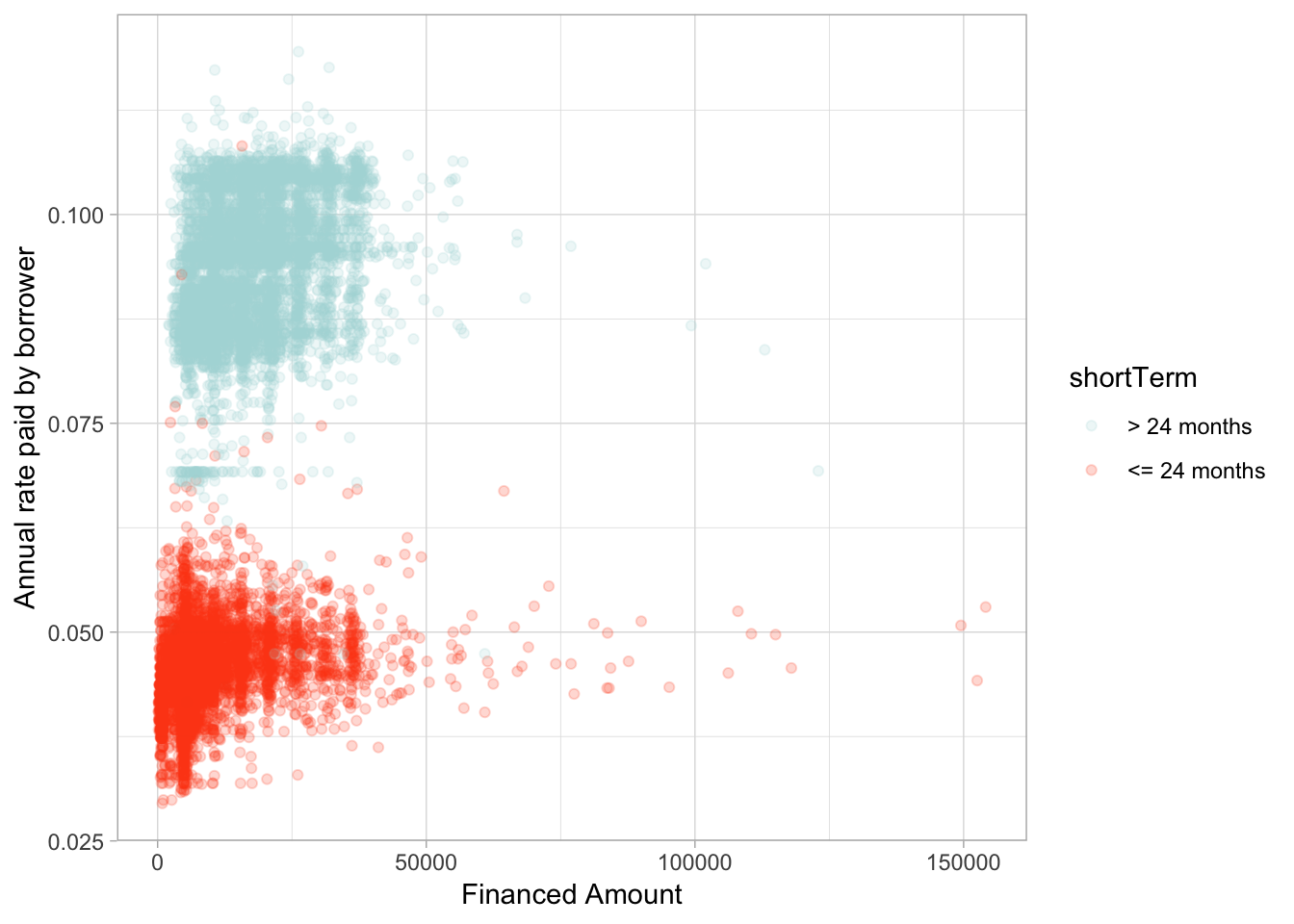
Quite clearly, someone who borrows an amount for a longer term is perceived as higher risk and pays a higher rate of interest. This is an observation we could not have made without some domain knowledge.
Not quite ready to do it in R yet?
Excel has you covered here as well. A scatterplot gets you part of the way.

Excel if statement and scatter plot
A simple if statement creates the new variable and if you add that into a scatterplot you have something that shows this relationship.

Two coloured scatterplots are a pain in the posterior distribution in Excel, to be perfectly frank.
Tip Four: Think about where the uncertainty lies
This brings me to my fourth tip. The data sciences exist because of uncertainty. As accountants, you’re all very familiar with uncertainty.
While the process of audit or the rules of double entry book keeping might be fairly finite, the value you provide to your stakeholder is being able to take a complex real world problem, full of uncertainty and make recommendations. It’s the same for data sciences.
There’s an impression going around that data science is valuable because it can be complex. But being data driven is about thinking about where the uncertainty lies, not pretending it’s not there with some equations and code. Being data driven is about using the data we have to make an informed recommendation.
Back to our kickstarter data, we can visualise the campaigns in a different way.
ggplot(kdata) +
  geom_point(aes(launched, log(usd_pledged_real), colour = state), alpha = 0.2) +
 # ggtitle("Pledges over time by state")+
  scale_colour_manual(values = c("#660066", "#0d1a26", "#ff4a1a", "#00cccc", "#ffccff", "#ff80ff")) +
  xlab("Launch date") +
  ylab("log $US pledged)")+
  theme_light()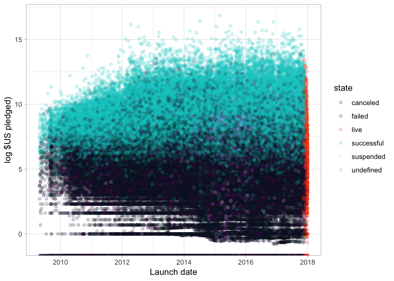
Often in a business context, your stakeholder wants to know: based on what’s happened in the past, will our plan work in the future.
What goes into success? Can we start thinking about kickstarter successes?
There’s clearly a lot of uncertainty over whether or not a campaign will be successful. I mean potato salad?
Here we have all the campaigns launched on the site and whether they failed, succeeded, were cancelled or are still going. I like this chart because you can see the ‘live window’ on the end here. It shows just how ephermeral these campaigns are. The salad situation is long gone in kickstarter land!
Broadly, the chart confirms our expectations: campaigns with a lot of money pledged are more likely to be successful than those who don’t. Great!
But the uncertainty is all over this chart – knowing where uncertainty is, knowing that data driven tools and techniques can’t take it away, they can just tell you where it is, is critical to undertstanding your data.
There’s clearly overlap of pledges here between success and failure and it’s really broad – what is it about those campaigns that have large amounts of money pledged, but still failed? Was it the amount they were asking for? Was it something else? Data science can start answering these questions.
But without viualisation, we wouldn’t know to ask them, without visualisation we wouldn’t have a good understanding just how much uncertainty there is here.
Honestly, I can’t think of a great way to produce this graph in Excel. While I advocate for just getting started, there are some things that a dedicated data science tool is just better at. However, you can start to think about uncertainty in your data and how that might play into your decisions and the questions you’d like to ask.
Tip Five: Calculate to communicate
My final tip is a fairly simple one. Data driven thinking is incredibly powerful: but so is communication
The best, most complex, scientific thinking in the world is undermined, if the people who could use it, can’t access it. The most under rated skill in data work is the ability to communicate it. That’s where the value lies!
You have to tell the people you’re driving where you’re going and why. How do you communicate your findings to your stakeholders? Here’s some tips:
*No techie language
* Explain relationships simply
* Make sure you’re communicating uncertainty: we don’t offer many rock solid propositions in data science, we offer varying degrees of certainty!
* Visualisation is one of the most important communication tools available to you.
Get behind the wheel
You can start working towards data driven decisions today. There’s no license for getting out there and visualising your data, having a go is the start point.
There’s no test that lets you build connections by creating new variables, or joining data sets together – it’s a matter of exploring where you’re going.
Looking for uncertainty is definitely a challenge, but even just thinking about it is a huge step toward data driven decision making.
Being data driven is about a skillset, not a toolkit. Don’t get me wrong, tools like R give you choices. But you don’t need any particular tool to start - if all you have is Excel today, use that.
Resources
New to data visualisation? Check out Di Cook and Stuart Lee’s brilliant rookie tips.